Weaving Through The Fabric of Time: A Case Study On Our New Logo
As we entered a new era with The Beautiful Project, we felt that the organization needed a rebrand that would more accurately tell the story of not just where we’ve been, but where we are headed.


Where We’ve Been
Our original logo that we affectionately named “Sis with the Fist” was a depiction of the work that we’ve done for years centering representational justice and the intersection of arts and activism for Black girls and women. Its fun ink-splash graphic and font calls to the Pen aspect of our methodology where writing is used as a tool for Black girls and women to express their power to own their narratives.

Harriet Powers. Pictorial quilt. 1895-98. Museum of Fine Arts, Boston
Where We’re Going
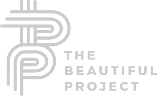
When TBP’s graphic designer, Winnie Okwakol, sat down to think about what a new logo could look like for this new era for The Beautiful Project, the word that stayed with her the most was “time”.
She thought of the intergenerational work that is done here through the Staff and our Beautiful Community with 6th graders all the way through recent post-grad students.
She thought about how the fabric of this work is rooted in storytelling, much like the African American tradition of story quilts.
The Beautiful Project’s commitment to representational justice and collective care continues as we expand our language to embrace gender-expansive youth. We needed a logo that represented our structural change, inclusiveness, but also represented the essence of the work we’ve been doing for over 15 years.
The Breakdown
Starting with our new minimalist color palette, we decided to keep the colors for the logo very simple because our various campaigns, exhibitions, programs, and productions all have their very own branding. To accommodate the expansiveness under the TBP umbrella, Winnie chose a greyscale palette with a meaningful icon design.
Winnie’s notes:Use the acronym to create an iconDifferent weaving patterns to signify the impact that Beautiful is making in this timeFeels communal, ancestral, element of community
Winnie’s notes:The circle to represent the pastContinuity, life long commitment, Open a little to leave room for change and for the community to come in and participate;Room for outsiders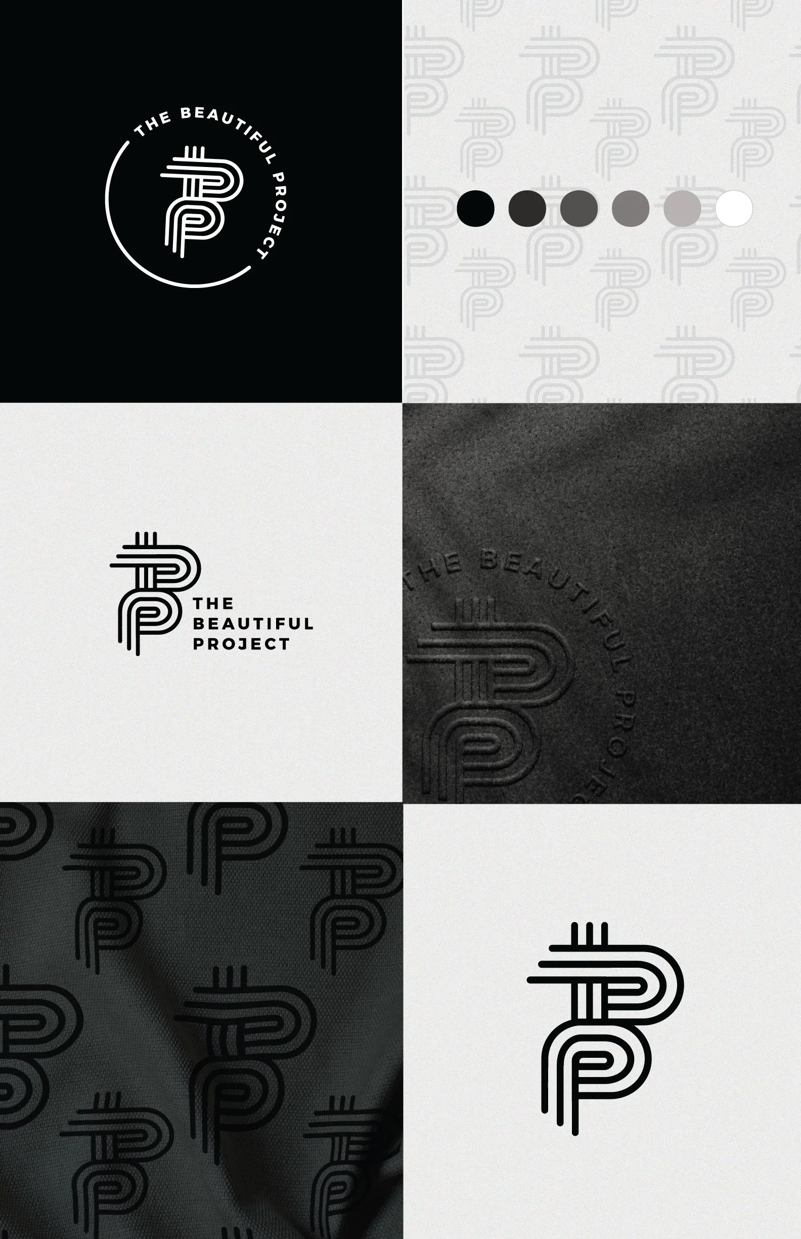
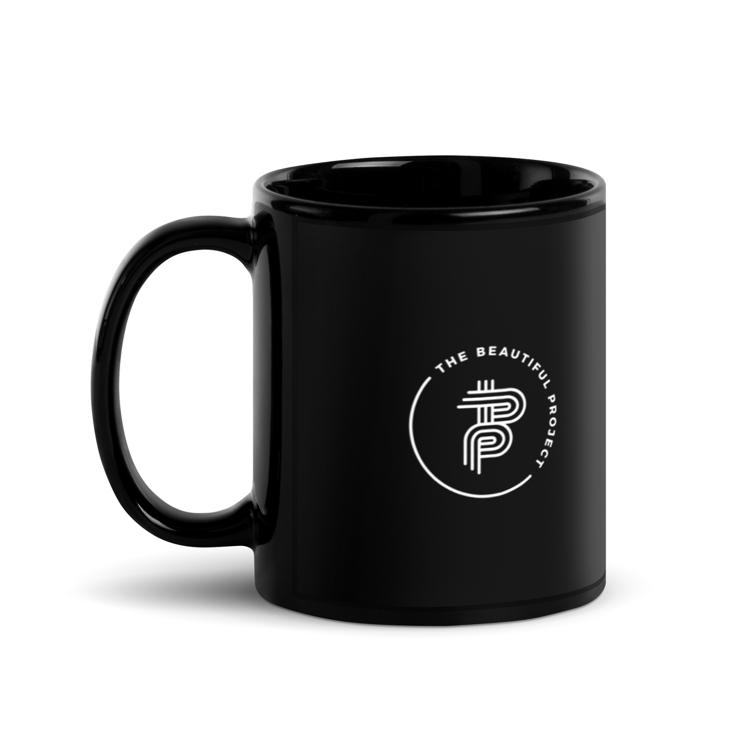
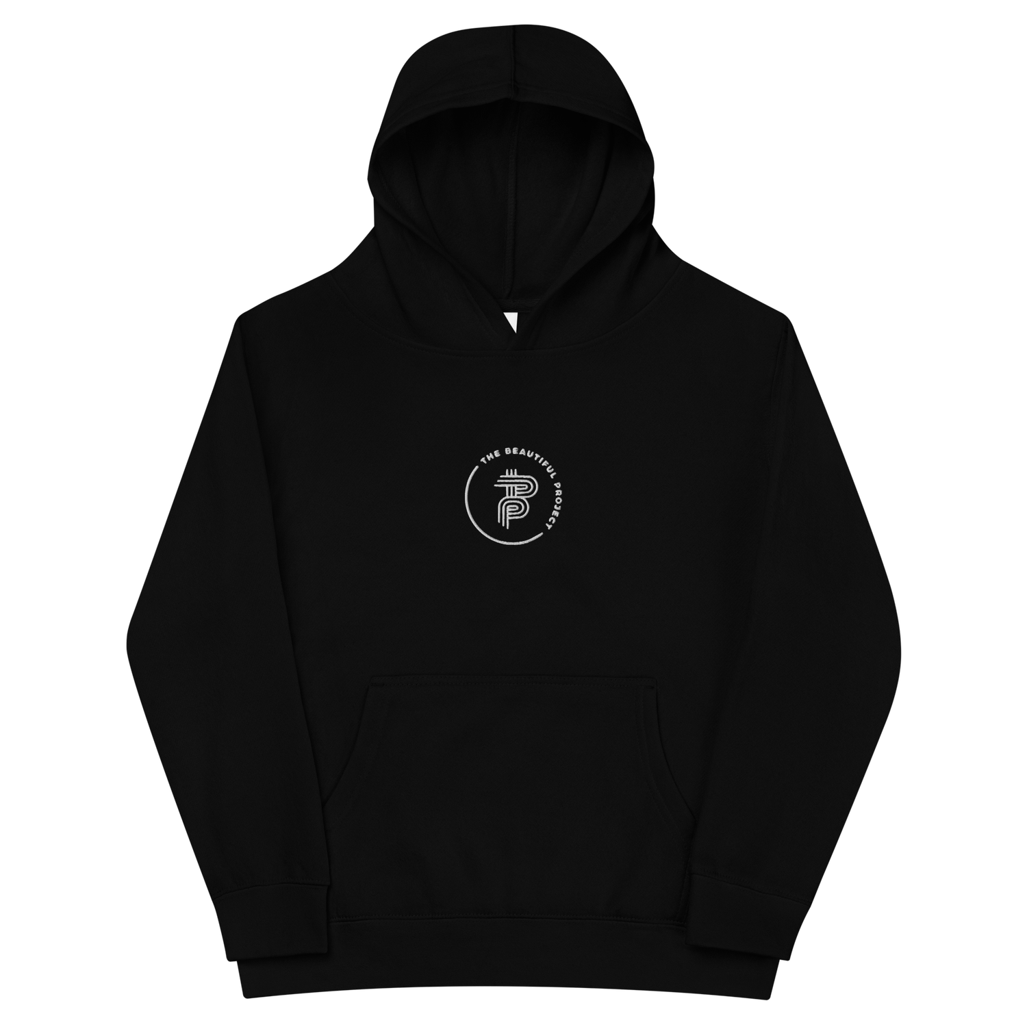
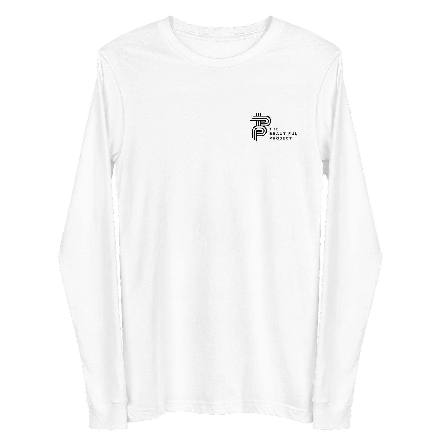
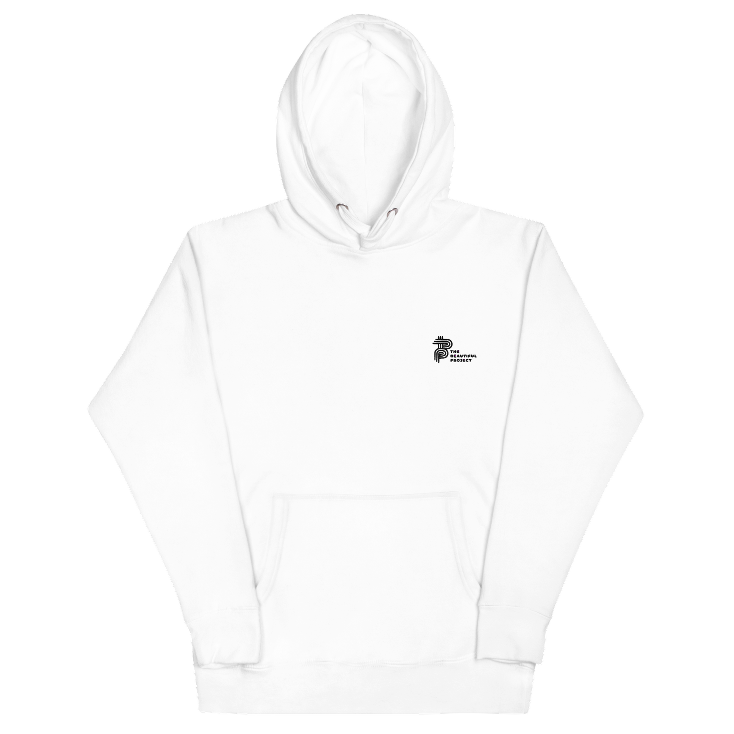
Shop Beautiful Logo Collection
In celebration of our new logo, we’re launching The Logo Collection for Shop Beautiful. Discover threads, accessories, and home goods thoughtfully designed by our graphic designer, Winnie Okwakol. All purchases go towards supporting programs at The Beautiful Project.